Purchase
Buy - Select License
& Sans will soon be available to purchase online for desktop, web and app. If you would like to be notified when the first release is live, please submit your email address below
Success!
Your email has been registered. You'll receive an update when & Sans is available for purchase.
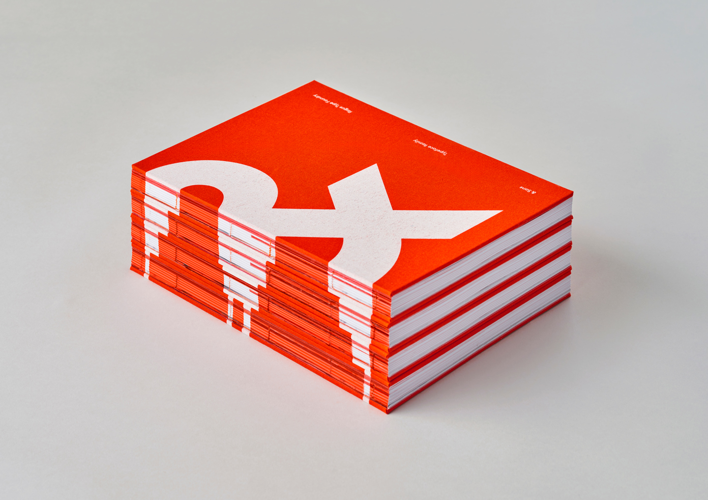
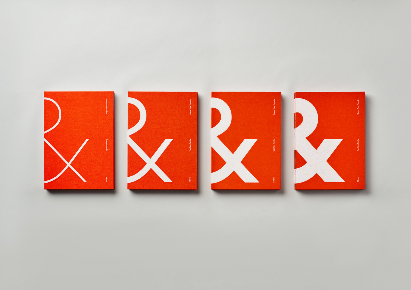
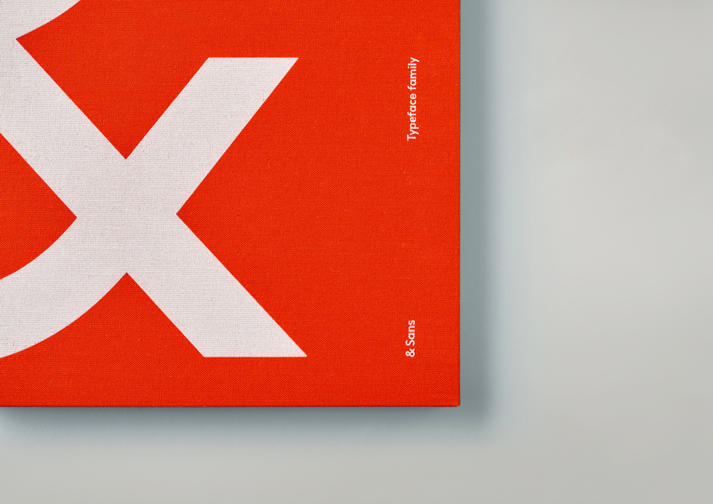
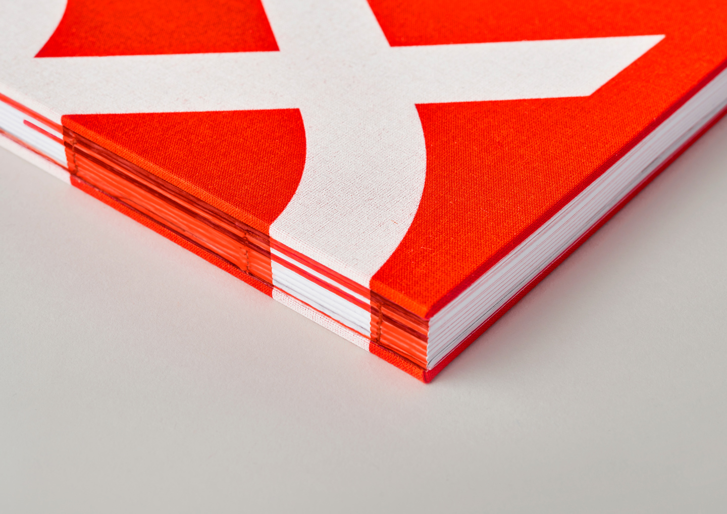
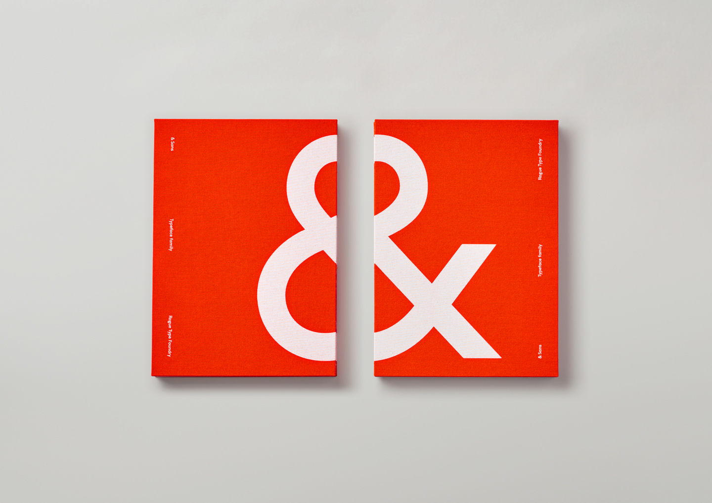
& Sans®
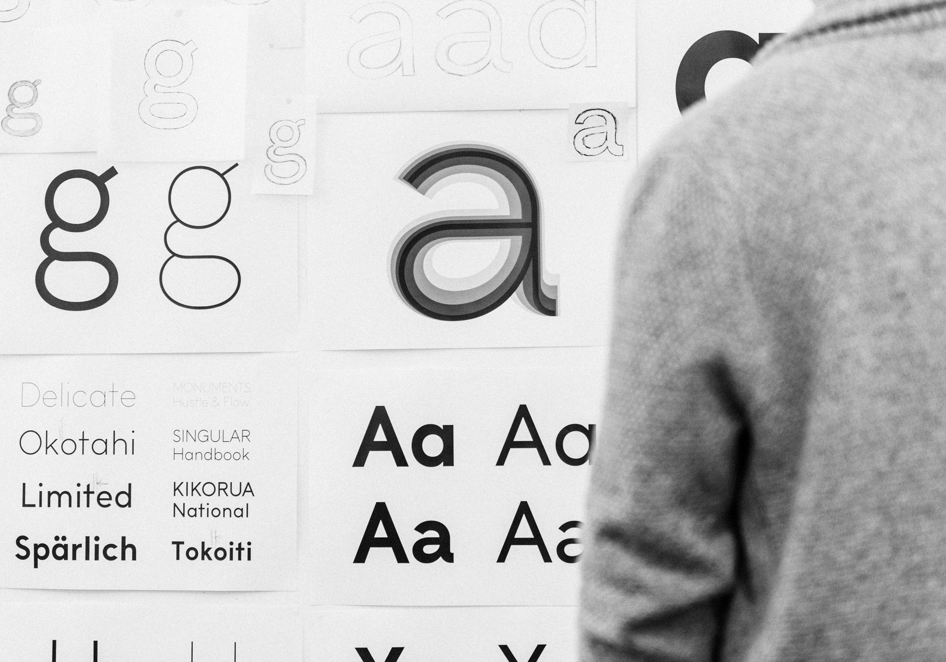
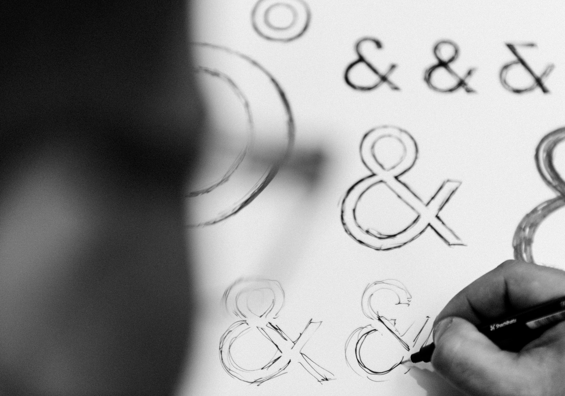
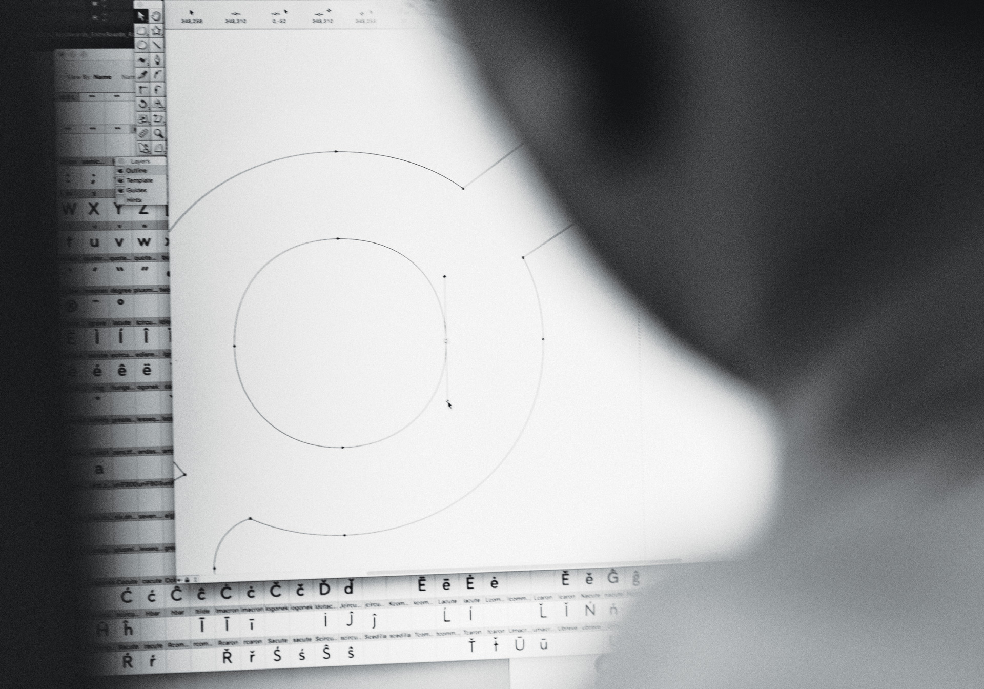
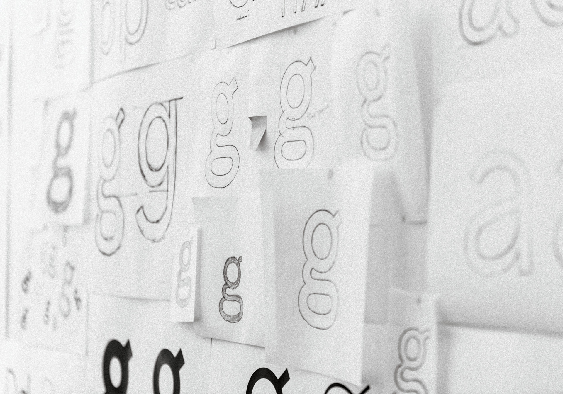
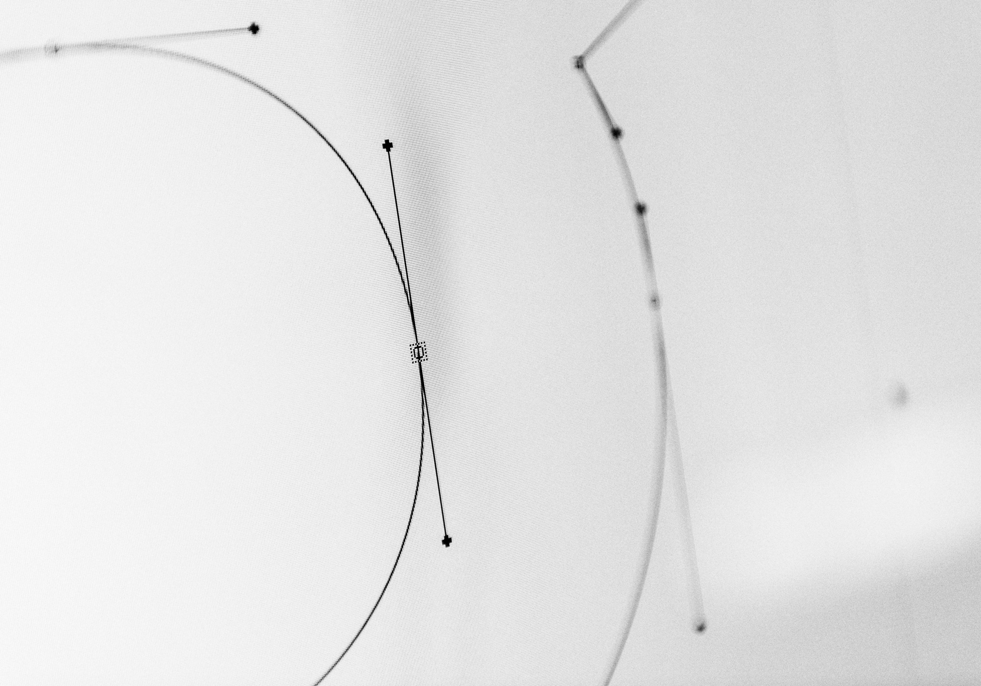
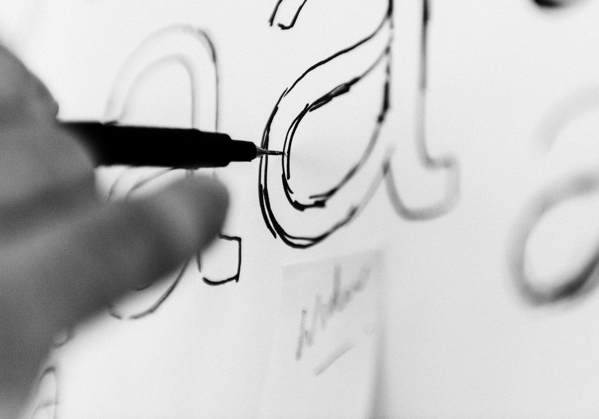
& Sans is a geometric sans serif typeface family of over 270 individual glyphs and 8 cuts.
Created by Rogue Type Foundry in New Zealand, it is intentionally designed to be multi-use – perfect for both display and body text, as a portfolio or design studio typeface.
Its geometric makeup means it is graphic and characterful, while sharp reoccurring angles – echoed through letterforms – result in an overall visual cohesion.
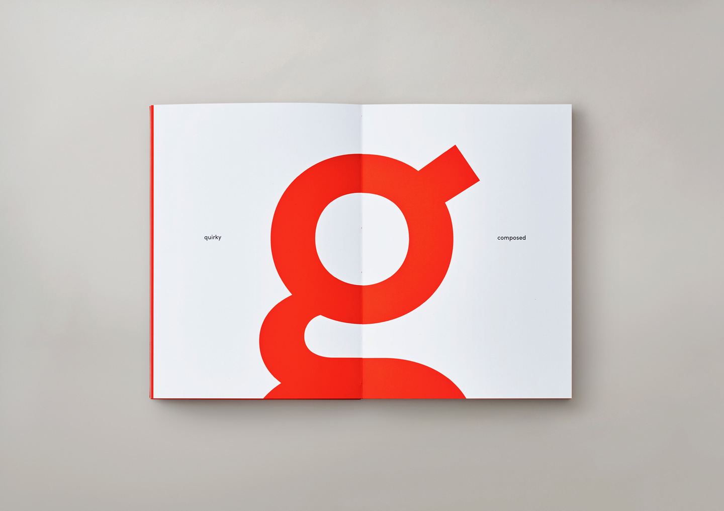
It is organised and clean, with a distinctly simple structure. Varying letterform widths make for playful reading and pace.
By synchronising strict geometry and aesthetic alterations, we struck the fine balance between technical and visual perfection.
The result is a typeface that is simultaneously expressive and unassuming, flexible and structured, raw and refined.
It blurs form and function. It is balanced, full-bodied and open. It is characterful, quirky and chameleonic. It can shout and shush, enrich and simplify, smile and wink or say it straight faced. It is more and less.
It is & Sans.
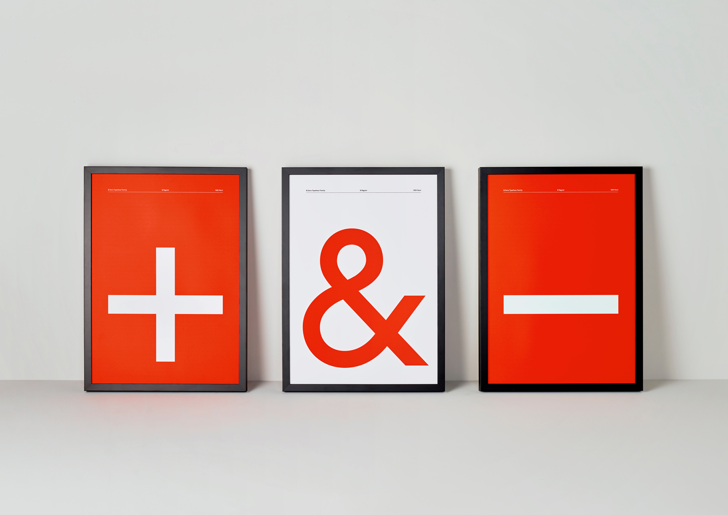
&
/and/
Addition, connection, evolution.
& Sans is the joiner of two things – of two worlds. A typeface that has the ability to exemplify the idea of ‘more’. More character, more voice, more volume.
Sans
/without/
Absence, purity, refinement.
& Sans embodies the ideas of minimalism and simplification. It has the ability to turn down the noise, blend into the background, read easy and work hard.

142 Point / 146 Point
142 Point / 146 Point
64 Point / 68 Point
44 Point / 48 Point
32 Point / 36 Point
20 Point / 24 Point
12 Point / 16 Point
8 Point / 12 Point
Often referred to as the International Typographic Style or the International Style, the style of design that originated in Switzerland in the 1940s and 50s was the basis of much of the development of graphic design during the mid 20th century. Led by designers Josef Müller-Brockmann at the Zurich School of Arts and Krafts and Armin Hofmann at the Basel School of Design, the style favored simplicity, legibility and objectivity.
Often referred to as the International Typographic Style or the International Style, the style of design that originated in Switzerland in the 1940s and 50s was the basis of much of the development of graphic design during the mid 20th century. Led by designers Josef Müller-Brockmann at the Zurich School of Arts and Krafts and Armin Hofmann at the Basel School of Design, the style favored simplicity, legibility and objectivity.
Often referred to as the International Typographic Style or the International Style, the style of design that originated in Switzerland in the 1940s and 50s was the basis of much of the development of graphic design during the mid 20th century. Led by designers Josef Müller-Brockmann at the Zurich School of Arts and Krafts and Armin Hofmann at the Basel School of Design, the style favored simplicity, legibility and objectivity.
Often referred to as the International Typographic Style or the International Style, the style of design that originated in Switzerland in the 1940s and 50s was the basis of much of the development of graphic design during the mid 20th century. Led by designers Josef Müller-Brockmann at the Zurich School of Arts and Krafts and Armin Hofmann at the Basel School of Design, the style favored simplicity, legibility and objectivity.